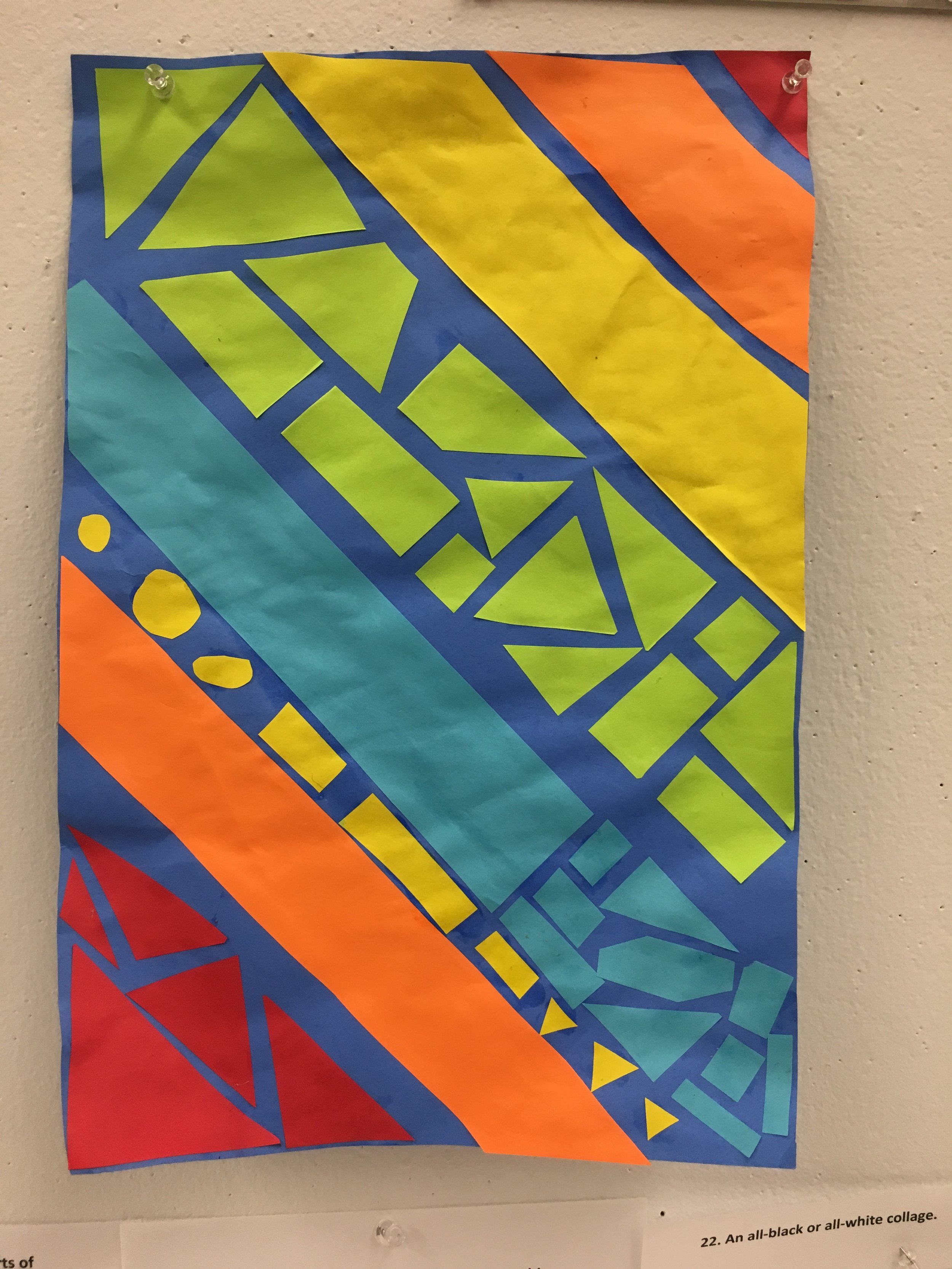
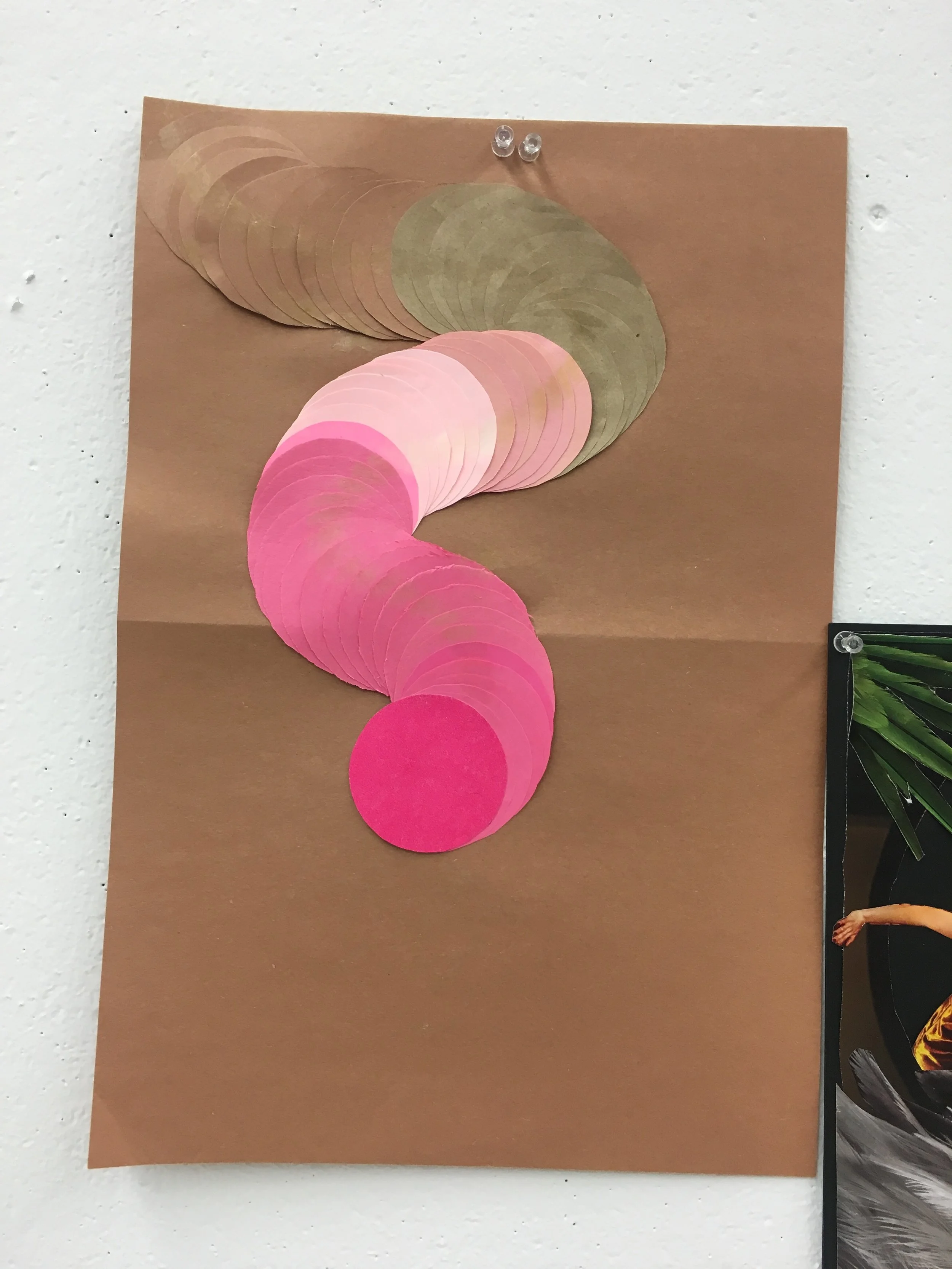
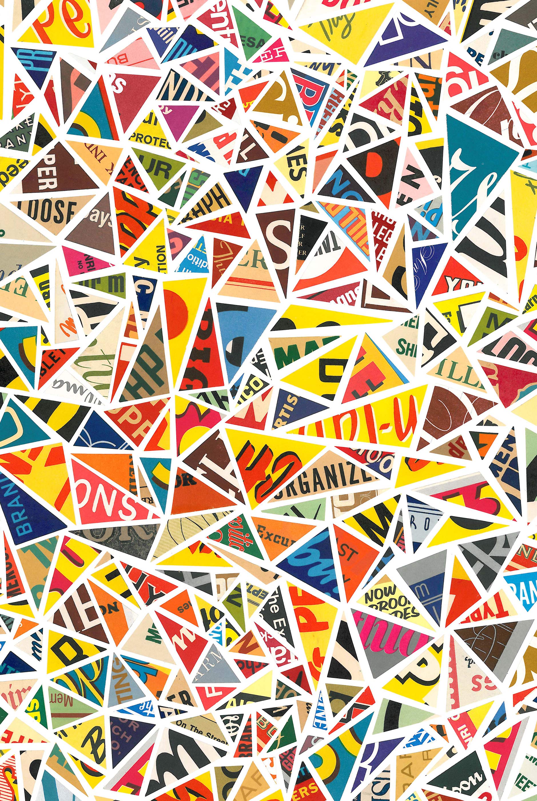
Class Notes:
Kinds of Collages:
Text based/image based (making out of pre existing pieces), texture based, color based.
Create a completely different subject: sometimes with humor, juxtaposition, another scene, and building with shapes
VTS (Visual thinking strategies):
What is going on in this piece? What do you see that makes you say that? What more can you find?
Artists who work with collage:
Barbara Campbell Thomas: limited color palette, distinct shapes, layers, repeating patterns that are organized compositionally
Janet Jones: layering, subtle color changes, used objects with history, natural discoloration
Sophie Aston: contrasting subjects, classical vs. contemporary images/material, contrast color
Dale Copeland: misty color, not just using 2D material
Sylvia Weir: primary colors, balanced composition, something found in the home
Below are pictures of the steps I took to create my collages:


Journal Writing, Collage 1:
Which of the 20+ prompts did you choose? What attracted you to these?
I chose the 2nd prompt about using collage to explore patter, rhythm, symmetry/asymmetry, consonance/dissonance. What attracted me to this was the minimal/simplistic nature of the prompt. I wanted to see what I could accomplish with simple shapes and make form.
How did you go about choosing materials? What do the materials have to do with the prompts?
I chose a piece of paper with a simple but stand out pattern to contribute to the specifications of the prompt. I was hoping that pattern would contribute to the movement of the piece. I also wanted to use the pattern to my advantage and manipulate it in a way that promoted rhythm within the folds I made. The direction of the paper promoted eye movement.
How did you go about changing and arranging materials? How did your ideas develop and shift as you were working?
I started by cutting the paper into strips to use the pattern as part of a larger composition. But, then I decided that the strips of paper should be the composition itself. I used skills I already know about how to make paper stairs from strips of paper. I changed the process of making them by not completing the form, but repeated the process of folding multiple times to create a repeating geometric pattern. Based on the patter, previous knowledge, and prompt, I began folding and combining multiple objects to create an overall movement composition.
What do these pieces express to you? What details of the pieces contribute to these markings?
This piece expresses to me a sense of nostalgia with a twist of newness and ideas of design. The nostalgia comes from the folded technique I brought back from my childhood. The twist comes from how I used the process/technique of making paper stars. The ideas of design come from the repetition and placement/composition of the pieces.
What works best about each collage? What are your successes?
The composition that I glued the strips of paper in is what worked best and took the pieces of paper to another meaning as a completed collage. The other success I've had is the way I connected many strips of paper together to repeat the pattern even more. Also how I cut the basic paper to reflect the desired movement.
What would you do differently? Why?
I would have made more strips and repeated the pattern. I would also change the kind of paper I would use to explore what kind of material would change the idea and design movement.
What was it like for you working in collage as a process and medium--To what extent was it pleasurable, challenging, frustrating, feeling, etc.?
It was pleasurable to see how I could push my creativity and problem solving of material. It was challenging to start, but then once I had an idea to follow, I felt better about pushing the material and experiment putting the pieces together. It was frustrating to experiment for so long with a prompt to guid me/challenge/final expectation.
Journal Writing, Collage 2:
Which of the 20+ prompts did you choose? What attracted you to these?
I chose the prompt that requires me to represent a physical space. This attracted me because of the geometric shape of my material (playing cards) and the geometric design of the cards, which pushed me towards attempting to represent a city scape.
How did you go about choosing materials? What do the materials have to do with the prompts?
I chose this material because I had many playing card sets, and wanted to repurpose them. I also wanted to see how much I could utilize a material that isn't thought of as a medium. It doesn't have much to do with the prompt other than their right angles, and straight edged quality, which was better to represent a city scape.
How did you go about changing and arranging materials? How did your ideas develop and shift as you were working?
The challenge I gave myself was creating a base out of the material itself. So as I was working, I had to think of a creative way to connect all the cards as a unified "sculpture." It required a lot of problem solving and trial and error. Once I had a base, the next challenge was how I could manipulate the individual cards to create a city scape. The ideas I had to create the city scape changed because of the difficulty of cutting the cards. I tried to avoid it and place the cards in a more interesting way than cutting all of them.
What do these pieces express to you? What details of the pieces contribute to these markings?
This piece expresses a bright light city. The details that contribute to it is the pink and blue florescent colors on the back of the cards. Another quality is the fact that I cut some of the spade shapes out of the cards to show details through it rather than just black. I think it gives the effect of lights shining out of a building. I believe the overlapping quality contributes to the look that a city scape has of one building on top of another.
What works best about each collage? What are your successes?
What works best in this collage is the overlapping composition of the cards to create a city scape. I think that the layering contributes to the physical dimension of some cards being closer/farther, and represents the depth of a city scape. The most successful part is the base I created by combining/overlapping/connection cards together to create a flat/even plane with structure to handle the cards being glued on top of them.
What would you do differently? Why?
I would have done things differently by having a variation in material. I should have added different textures and colors to better differentiate between buildings of the city scape. I think that this could add more dimension to the 2D quality.
What was it like for you working in collage as a process and medium--To what extent was it pleasurable, challenging, frustrating, feeling, etc.?
I enjoyed working with this material because I had a clearer idea in mind when I started. It was still challenging to create a more creative composition to represent my idea. I liked learning more about how to create a pattern, and how to push regular playing cards into another shape.
Below is a slideshow of the final collage pieces that my class and I did:


Contemporary Collage Artists:
@revolvingstyle
blog: http://www.revolvingstyle.net/ instagram: https://www.instagram.com/revolvingstyle/?hl=en
The artists name is Patrick Keohane. He is a California based college artists who has made his fame by created collages by hand, without using Photoshop. Many of his colleges have been featured in magazines and online blogs/magazines. Since the focus of his work is on celebrities and fashion, some of his work has also been featured on models' Instagram's as well. I have found him when searching fashion illustrators on Instagram, but fell in love with his unique and distinct style. He has taken his passion for art, fashion, and authenticity to another level of visual aesthetics and artistic technique. As I was researching him online, I found that he wears many hats. One of those hats include being a fashion blogger. He is very interactive and responsive to his fans on Instagram. I have commented on many of his photos about his artistic, and he has always taken the time to respond.
What I really admire about his work are the color schemes, sense of composition, and craftsmanship. I had asked him how he is able to upload such clear works of his art to Instagram (since all of his photos are so professional looking that one would think he used Photoshop to create them). He responded that he takes pictures of them with a DSLR or scans them into his computer. I find it so impressive that he is able to achieve such a clean and cut look to his work. I believe that the fact he works by hand puts new meaning into his work and collage as a medium. I also think that his artistic style reflects society's recent trends in fashion, which attributes to his success. A few months ago, I had also asked him if he had designed Haley's new music album cover, since the style of album art is very similar to his. He responded that he did not, but was aware of the fact that it is so similar. To which I replied that I liked his style better. As a teacher, I think that he could inspire my own students to keep fine art alive and provide an example of someone making a career out of passion.
Greg Lamarche
website: http://www.greglamarche.com/
Greg Lamarche was born and raised in New York City. As stated in his bio on his website, he learned about college in 6th grade and continued working at home with firework wrappers found around his neighborhood. Since that moment, he had worked with college and began spraying graffiti around the city.
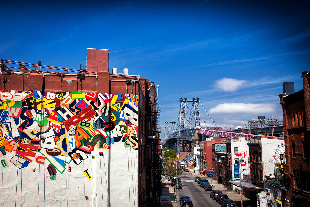
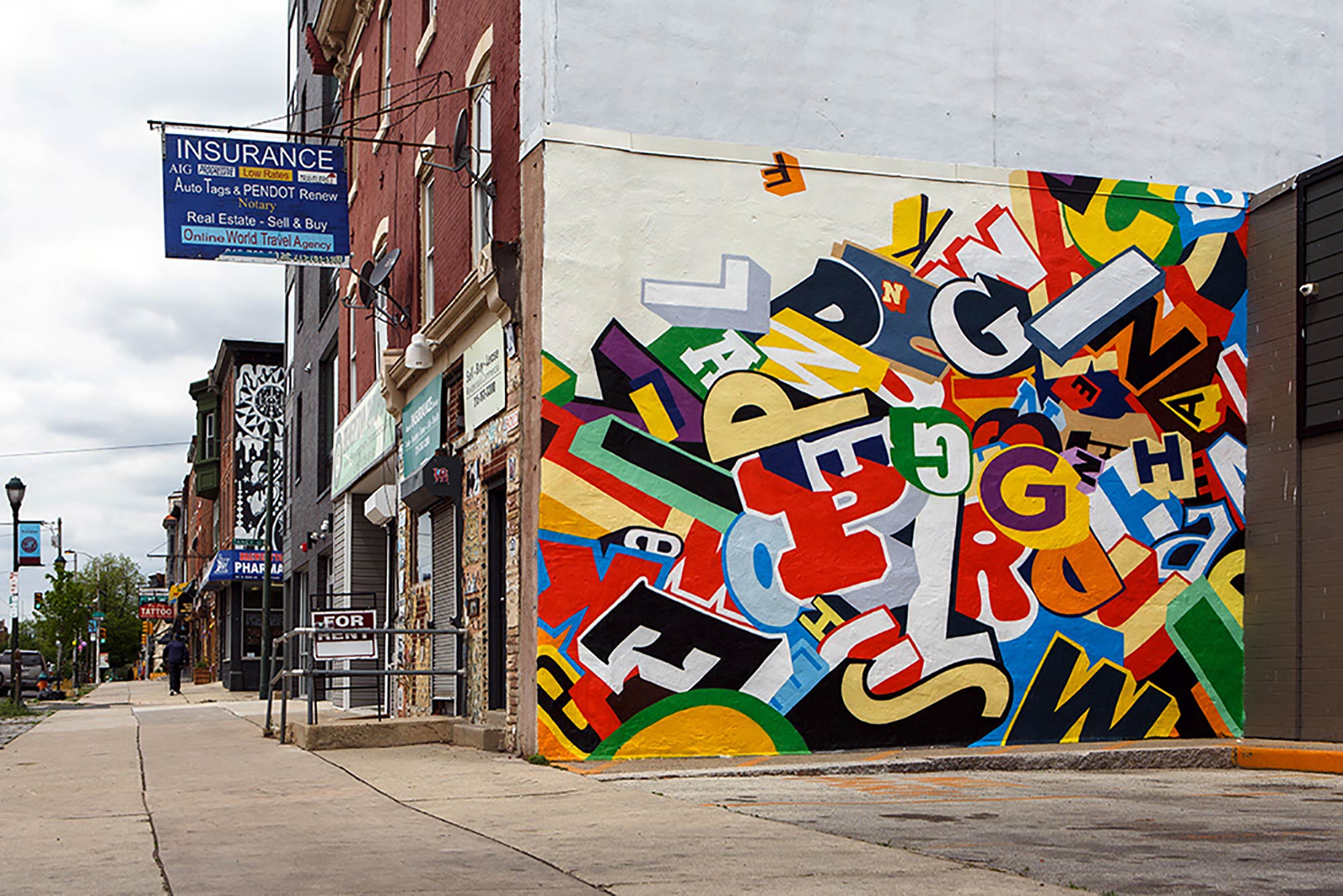
When looking at his work, you can clearly tell what his influences are. I had first seen his work in a café close to my home in Westchester. I have not been able to find a picture of it online, but it was a college created from cereal boxes, which I was fascinated with. I was interested in the typography and composition he uses in the piece, and wondered if I could create something like that as well. When looking at his work as an adult, I can clearly see that using commercial items has clearly influenced his interest in using the "cut out letters" style. I can also appreciate his work in graffiti, which influences his interest in typography as art. I really admire that he has made type into a medium of creative creation and not just as communication. As a teacher, I could use his work to show the importance of understanding characteristics of type, design, and color.
Lesson Plan:
Main Objective: Students learn about collage, composition, and color theory through history.
In terms of "history" students can choose to do a piece based on a culture or country that they are learning about in history, a personal memory, or any theme expressed with historically relevant materials/design. The students should connect their pieces with "historical" ideas so they are engaged with their projects based on their own interests. The materials used could be found materials or solid/designed paper in the classroom. This way, students can have some freedom to explore their own materials, as well as have a challenge for communicating ideas with limited materials. With limited materials, students will challenge themselves to rely on what they know about the visual attributes of their historical theme, and will be able to push material to its limits. The artist's that they would be introduced to would be Patrick Keohane and Susan Reedy. Patrick Keohane would be useful for students to know about because of his contemporary approach to collage, which could help if the students are responding to a memory in their project. Susan Reedy would be beneficial because of the way she is able to push materials. In a lot of her work, she scrapes, tears, paints, and layers material to communicate an idea. This would be helpful in experimenting to push materials.


