Journal Writing:
Characteristics of Graphite
Material Exploration...
Visual Qualities:
Grey
Metallic
Densities of marks depend on hardness of the graphite
Hard=lighter
Soft=darker
Looking closely, you can see small particles
Looking closely, you can see small ridges and bumps in the block of graphite
Hard marks create small graphite dust particles
Reflects light
Sound:
Rustic
Hard to smell in small quantities
Little to no smell in a large space with other smells
Touch:
Smooth
Easily manipulated with a hard object/tool, soft material
Lead rubs off on fingers easily
Sound:
Rough/scratch sound when making marks on paper
Scratched sounds vary in pitch based on the speed of mark making
High hard pitch when dropped/hit on a hard surface
Low pitch when hit against a stack of paper
Depending on the size of the graphite/pencil, the pitch will change when hit against another piece of graphite
Below are the pictures of my Material Exploration with Graphite:


Characteristics of Charcoal
Material Exploration...
Visual Qualities:
Color of the charcoal changes based on what kind it is
Smooth on long edges of the stick
Creates charcoal dust particles when making marks
Matte material, it doesn't reflect light
Can be made into a compressed stick and pencil charcoal material
Compressed charcoal can make larger strokes and thicker marks
Charcoal pencils can make thinner and more precise marks
White charcoal is easily changed by the other colors of charcoal, the particles will become mixed when touching each other in their original form and in marks on a surface
Smell:
Particles can make you sneeze
Could have a dusty/rustic sort of smell in larger quantities or in large sections in mark making
Touch:
Smooth
Residue is easily rubbed off on fingers
Compressed stick charcoal is easily breakable
The marks made on paper are easily manipulated by rubbing with your finger
Sound:
Rough when making marks
Hollow sound when hit on hard surfaces
Pressing too hard when making marks can make a squeaking noise
Below are the pictures of my Material Exploration with Black and WHite Charcoal:


Characteristics of Red Charcoal
Material Exploration...
Visual Qualities:
Color of the charcoal changes based on what shade of red it is
Smooth on long edges of the stick
Creates charcoal dust particles when making marks
Can be made into a compressed stick and pencil charcoal material
Compressed charcoal can make larger strokes and thicker marks
Charcoal pencils can make thinner and more precise marks
The different colors of red charcoal go well together when making light tones, mid tones, and shadows
Smell:
Particles can make you sneeze
Could have a dusty/rustic sort of smell in larger quantities or in large sections in mark making
Touch:
Smooth
Residue is easily rubbed off on fingers
Compressed stick charcoal is easily breakable
The marks made on paper are easily manipulated by rubbing with your finger
Sound:
Rough when making marks
Hollow sound when hit on hard surfaces
Pressing too hard when making marks can make a squeaking noise
Below are the pictures of my Material Exploration with Red Charcoal:


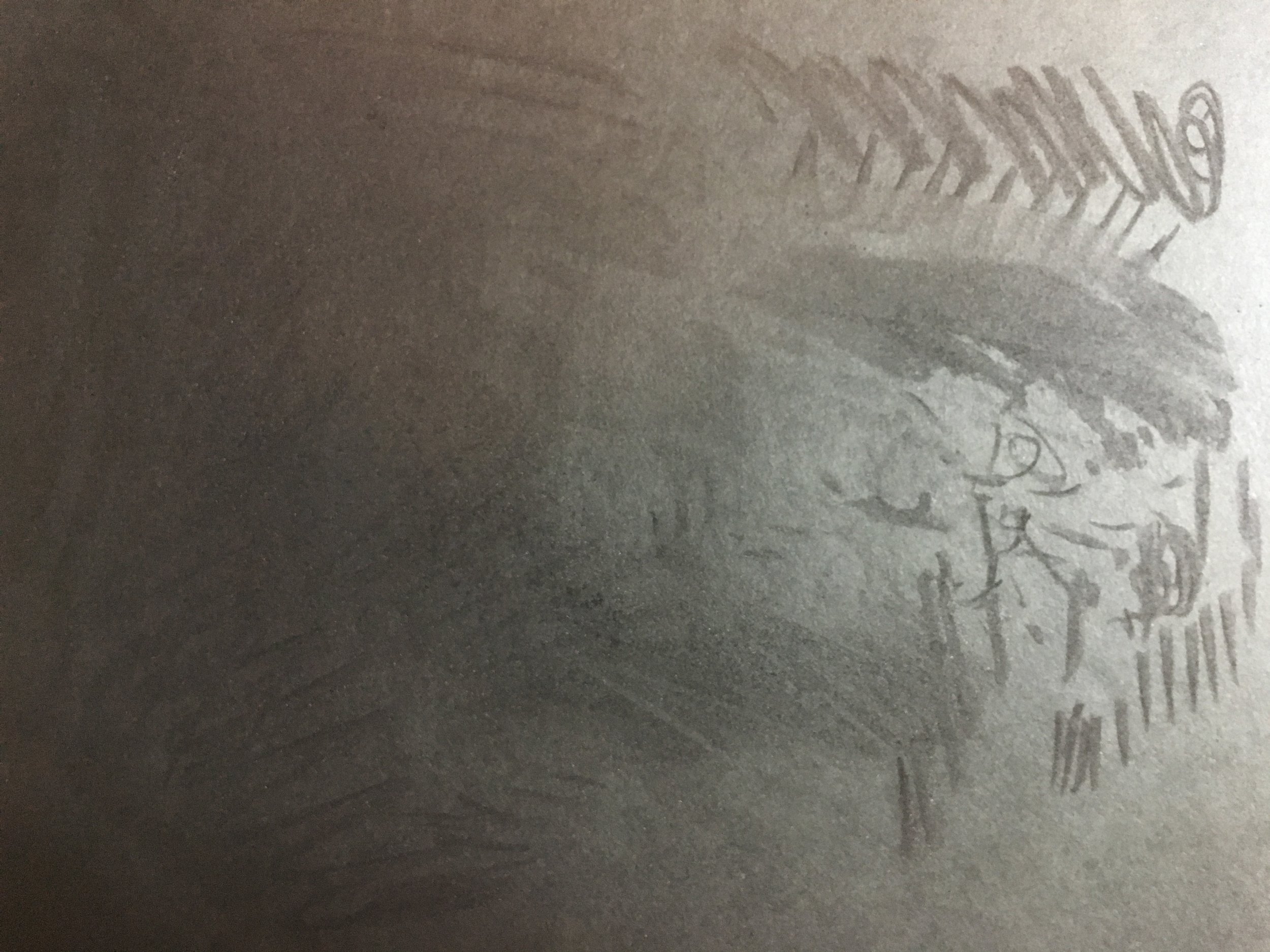
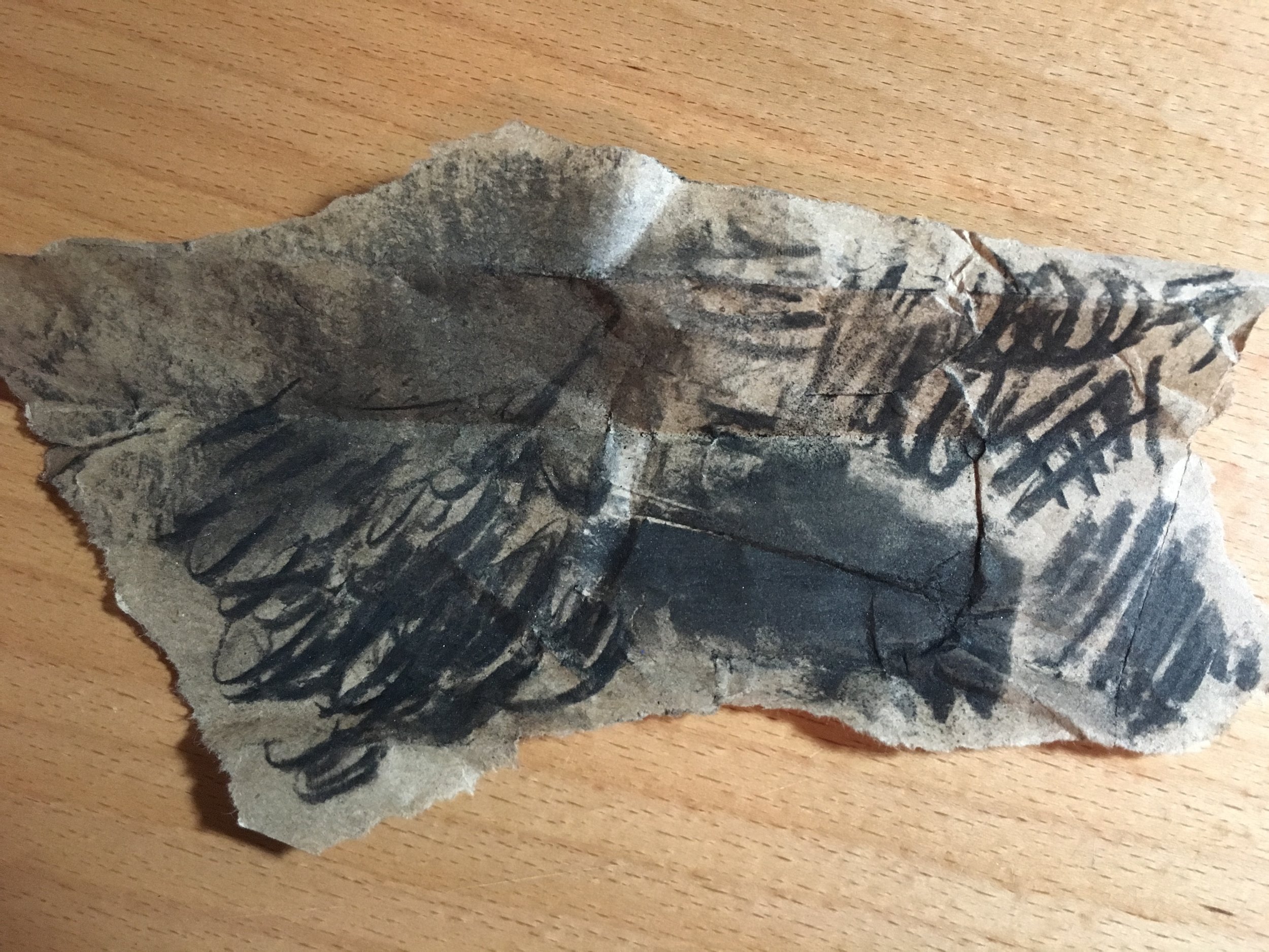
Characteristics of Vine Charcoal
Material Exploration...
Visual Qualities:
Smooth
Made of up long pieces of charcoal, not dust particles
Shiny/reflective
Not completely black when making marks, because of the not as tightly packed charcoal
Comes in many sizes
Thick and thin cylinders of charcoal
Varies in color based on the compactness of the material
Line quality and preciseness changes based on the size of the charcoal
Smell:
Little to no smell
Dust particles make people sneezy
Touch:
Soft
Very easily breakable, more than the compressed black charcoal
Residue is easily left on fingers
When marks are being made on a surface, they can easily come off by touching it, blowing on it, or moving the paper
Must be sprayed with fixative
Sound:
Rough on paper at first
Hollow when dropped on a hard surface
Dull sound when hit against other pieces of vine charcoal
Low scratching sound when shading
Below are the pictures of my Material Exploration with Vine Charcoal:



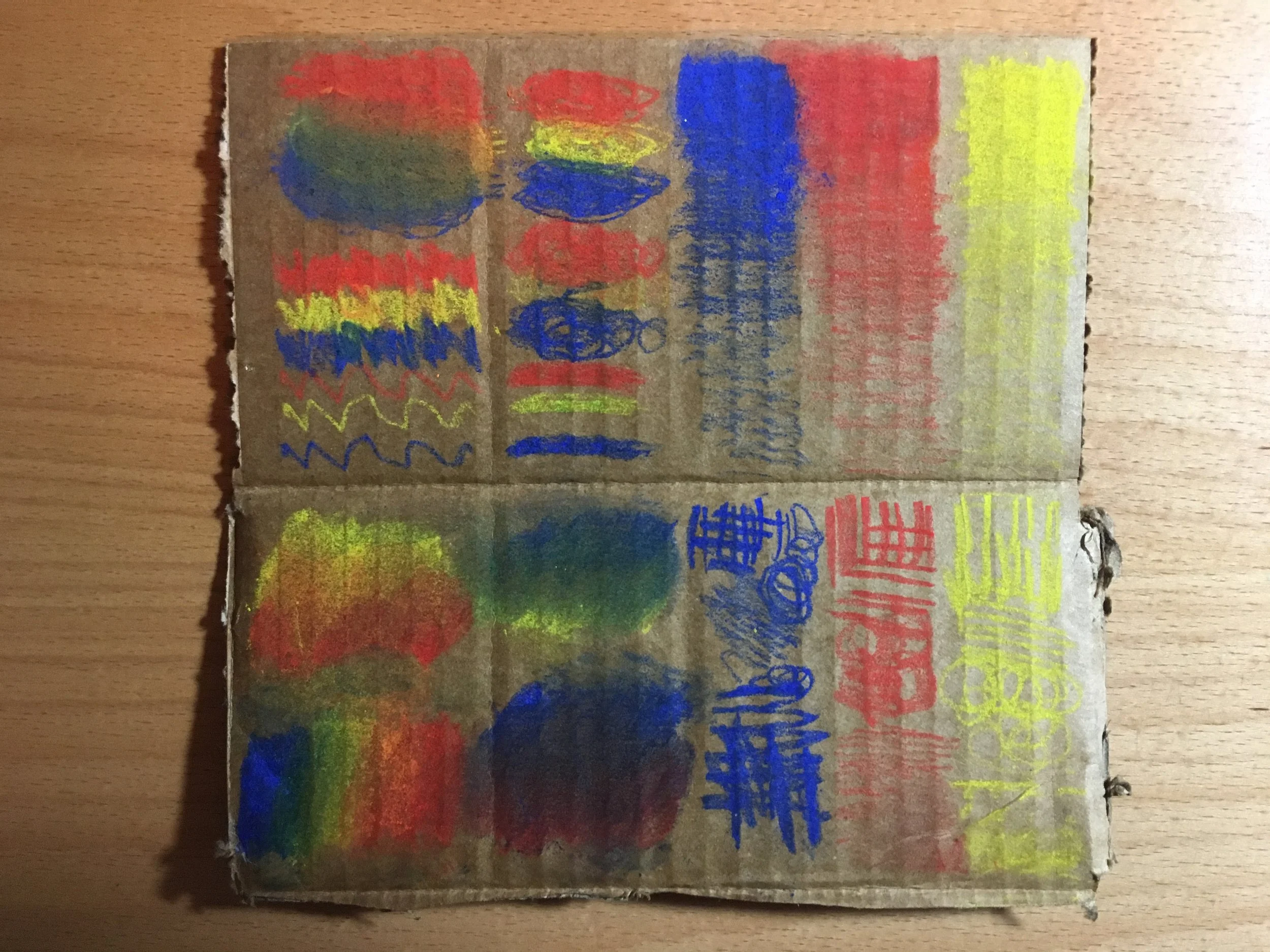
Characteristics of Chalk Pastels
Material Exploration...
Visual Qualities:
Multiple colors
Can come in a compressed stick form or a pencil form
Can see the particles when making marks
Similar qualities of compressed black charcoal
Does not fill paper well, must make multiple marks over one area to not show the surface behind it
Smell:
Little to no smell
Wood smell
Touch:
Some feel more "plastic" than others
Maybe because of how well the material is compressed
Smooth
Residue is easily rubbed off on hands in the original form and in the marks made on a surface
Sound:
Hollow sound when hit on a hard surface
Rough sound when making marks
Similar qualities to black charcoal
Below are the pictures of my Material Exploration with Chalk Pastels:




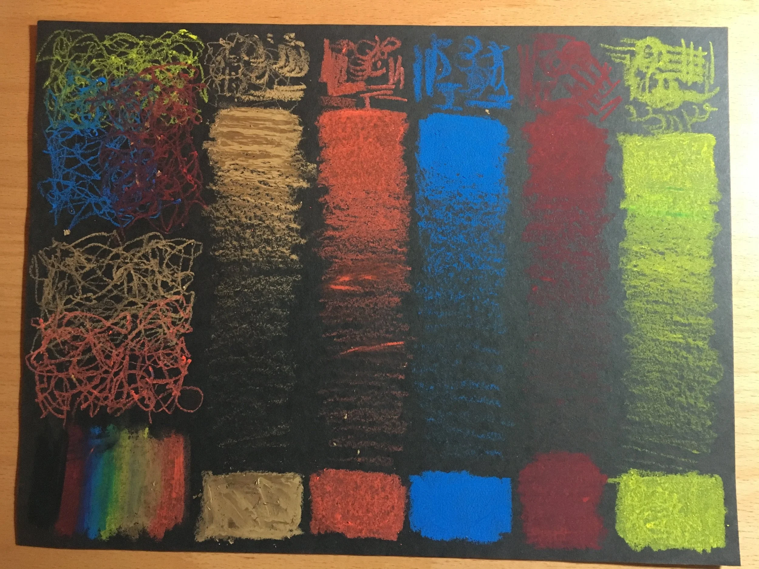
Characteristics of Oil Pastels
Material Exploration...
Visual Qualities:
Comes in many colors
The pack of oil pastels that I have include neon and metallic colors
Can easily stick to each other, so some of the pastels have other colors on them and can become "grey" based on how old and how many colors it has been around
Smooth, unless there are a lot of colors rubbed off on other pieces of oil pastels
SMell:
Oily
Somewhat plastic
Touch:
Oily
Looks smooth, but some resistance when running finger across the material in original form and when marks are made on a surface
Not exactly smooth mark making, unless pressed hard and making a solid area of color
Some pull when making marks because of the oil
Sound:
Somewhat louder sound on a hard surface
No sound when making multiple marks
Oils make no sound/smooth marks on a surface when making back and forth marks
Below are the pictures of my Material Exploration with Oil Pastels:



Characteristics of Felt Pens
Material Exploration...
Visual Qualities:
Black
Comes in various tip sizes and types
Round, angled, or brush
Has a dry time on certain surfaces that do not absorb the material quickly
Smell:
Little to no smell
Could depend on how toxic the ink
Touch:
Can easily make marks on fingers
Can be rubbed onto finders if the marks are not fully dry, it could make a smudge on the surface
Sound:
Scratching sound on paper when making marks on an angle
Little to no sound when making slow marks on a surface
Could make similar "marker" sounds when filling an area
Below are the pictures of my Material Exploration with Felt Pens:


Journal Writing:
In what ways do the different visual effects you're able to achieve communicate different ideas/feelings/states/moods?
The visual effects that I am able to create using these different materials and surfaces can create various tones in my art work. With heavier mark making (depending on the material and color) will make the purpose of the art work much stronger. Lighter mark making could hide or subdue some of the meaning behind the subject of a work of art. The kinds of marks that I am able to achieve can also communicate different tones because it could make a subject look "straight edge" or "twisted" based on how/where on the subject the marks are used. The previous explorations prove that I can change the visual effects of any subject and manipulate it into the tone I want.
Class Notes:
Collaboration
In class, we presented our material explorations and shared what qualities we found in the explorations we completed. We also spoke about how certain techniques are related to certain feelings, states, and moods. After the discussion, we created drawings that go along with the fabric installation from the previous week. For homework, we will be creating more drawings that can be added to the installation.
Below are pictures of our material exploration, fabric installation, and the drawings we did in class:


Homework:
Below are the pictures that our class made to supplement the fabric sculptures and drawings we made in class:


Class Notes:
After finishing drawings to go along with the fabric sculptures, we moved onto discussing how to teach drawing more effectively in the classroom. We did this by creating three drawings with different materials, different surfaces, and different tones from observation of a stuffed animal. Through doing this, we learned that a good way to get students to observe and exercise their drawing skills was by drawing the simple shapes shown in stuffed animals. The seams shown on the animal can be used as guidelines for a drawing. By utilizing different kinds of drawing material to create various tones, we learned how materials can create visual effects that can represent an object's surface qualities as well as moods.
During class, we displayed our work on a wall along with our stuffed animal. We discussed the differences between the materials we used and how they created different moods across our drawings. We also talked about what kinds of techniques we used to create our drawings. For example, we discussed the differences and similarities between our graphite on paper drawings. In particular, my drawing of the stuff elephant and other contour drawings of stuffed animals. We talked about shading techniques to create a drawing that looks 3-dimensional.
There were also many questions about the best ways to teach drawing in the classroom. First, using a stuffed animal for a subject is useful for students just starting to draw. The basic shapes in a stuffed animal are useful for observation and the subject itself is very intriguing for young students. To engage students even more, it is helpful for them to bring in objects that they are interested in. Secondly, when teaching how to shade it is useful for students to experiment and practice. It would be useful for students to create value scales, which is a system of organizing what a drawing material looks like when different pressures are applied to it (organizing values). There are two kinds of value scales; one is a continuous value scale that has the different pressures blending into each other, and the second is a broken value scale that has different sections to put a particular value. By filling in these value scales a student will have a better understanding of a material and how to use it to get different effects in their drawings.
Homework:
Below are images of drawings that my class made of their chosen stuffed animals:


Artists Who Work in Drawing:
Liath McGregor
website: http://laithmcgregor.blogspot.com/ instagram: https://www.instagram.com/laithmcgregor/?hl=en
I first encountered the artist Liath McGregor when I was traveling in Australia. His large mural of ballpoint pen and pencil intrigued me, and I wondered how he created so much detail simple drawing materials. Since then, I have followed his artistic career on Instagram, and tried to imitate his skill for detail in drawings. Liath McGregor lives and works between Byron Bay, Australia and Bali, Indonesia. In many of his works, he utilizes portraits and text. Below is a picture of the drawing that inspired me to look into more of his work.
Laith McGregor
Someone
2012
pen and ink on paper ping pong table
411.0 cm x 153.0 cm (table height: 76.0 cm)
Michelangelo
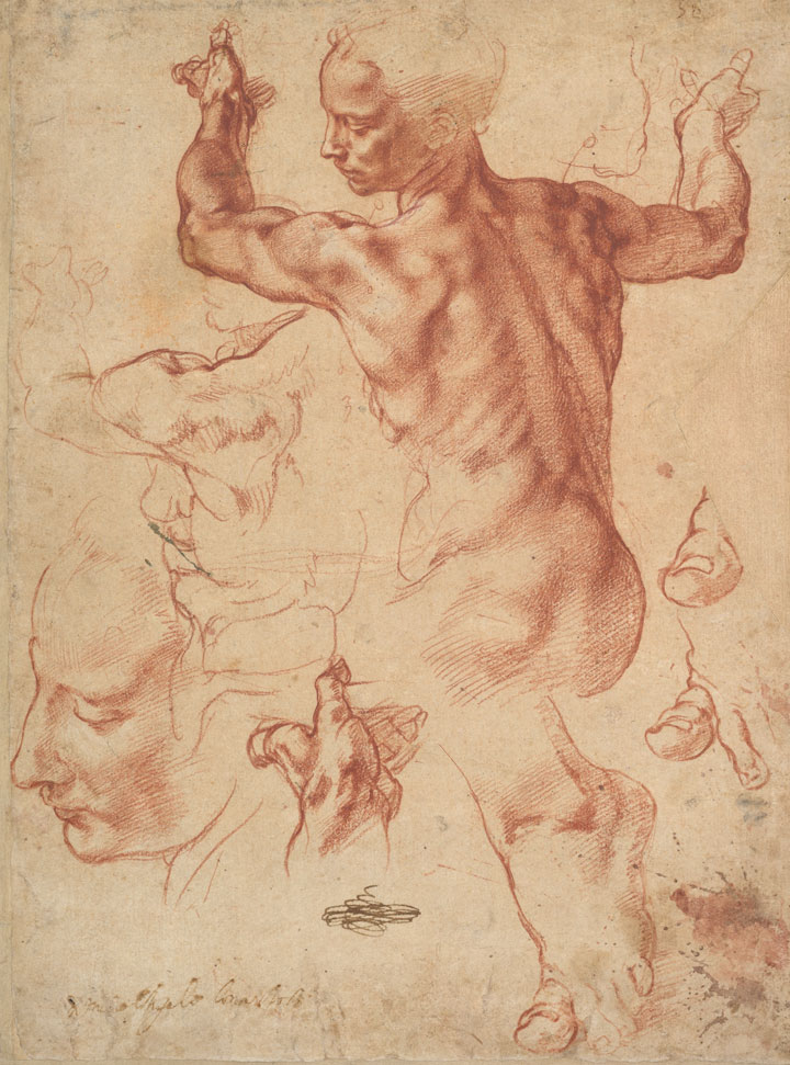
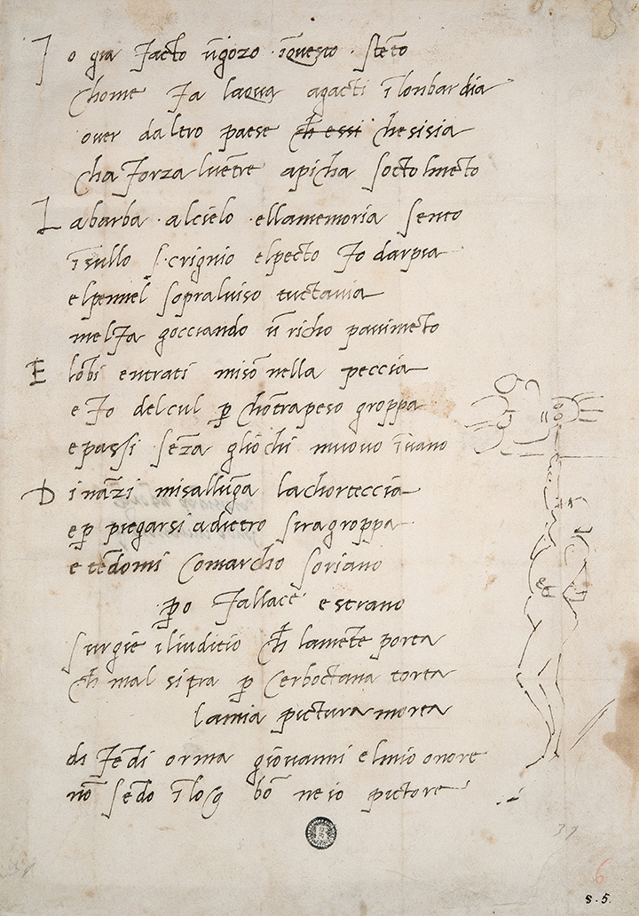
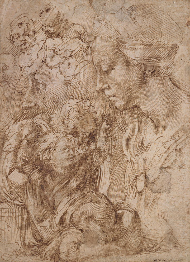
Since I started pursuing art as a career I had always been inspired by the Renaissance period in art. I was particularly interested in the work of Michelangelo because of his versatile artistic skill. His sculptures, drawings, sketches, and paintings inspired me to study abroad in Florence, Italy and adopt a Renaissance tone to to my own style of art. What I admire most about his work are the sketches of finished work he left behind. I recently visited the Metropolitan Museum of Art's exhibition that featured Michelangelo and his draftsmanship. The exhibition also included works of his predecessor's and apprentice's so visitors could compare his influences. Below are some pictures of his sketched featured at the exhibition.
Jean-Michel Basquiat
Throughout my artistic development, I have been pushed to build my observational skills to increase the realism aspect of my art. A lot of my work is about showcasing my talent by recreating subjects as exact as I can. But, Basquiat's art has inspired me to look further into my art and create deeper meanings. During my undergraduate career, I encountered his work for the first time and wondered how he became the artist he did. I learned that while growing up, his mother exposed him to many artists and took him to museums to expose him to various forms of art. I believe that this has pushed his artistic development well passed where I was as his age. He was able to look inside himself and gained experiences to eventually express them through art. His ability for self-reflection and analyzing the world around him, has resulted in endless works that make comments on society.
According to Acquavella Galleries, who hosted an exhibition of Basquiat's work from the Schorr Family Collection, "...Basquiat showed an affinity for drawing at an early age and this practice was a central component of his artistic output. Between 1980-88, the artist produced approximately 1000 works on paper, which articulate complex narratives, revealing flawed power structures and hinting at fundamental failings in social discourse." Like Michelangelo, Basquiat has had experience working in multiple mediums. Besides drawing he worked in paint and printmaking. Basquiat's recognizably unique and distinct artistic style brings attention to concepts by crossing out and repeatedly writing phrases throughout a work of art. His "primitive" style has inspired many to open their minds to the possibilities of art. Below is a work of art that I find particularly inspiring because of the various materials he uses to create powerful moods.
Jean-Michel Basquiat, Untitled (Estrella), 1985
Oil paintstick, graphite, and colored pencil on paper, 29 1/2 x 41 5/8 inches
The Schorr Family Collection
Lesson Example:
Main Objective: To practice working from observation and enhancing their understanding of form by translating a subject from physical, to a drawing (with the medium of their choice), and scanning their image to the computer to apply it to create a digital piece.
In Judy Burton's class, Artistic Development of Adolescents, I have learned about how art is being merged with technology to keep up with today's demand in the graphic arts. This lesson is for students on the middle and high school level and can be altered to students' abilities and experience in material.
To begin, students will have the opportunity to work from a subject that interests them. Depending on the students artistic development, they can work from a simple shaped object or a complex one. Personally, I would have students at the middle school level bring in an object that holds value to them, and I would have high school students choose more complex subjects like a portrait. If a student wants to do a self portrait they can work from a mirror, or if they want to work from another subject they can take their own reference photos and work from them. Once they have chosen their subjects, they can work in either graphite, pen and ink, compressed charcoal, conte crayon, chalk pastel, or oil pastel, even a combination of materials (depending on their material experience). Once they have completed their drawing, they will scan or photograph their work to be altered on the computer. They will utilize their drawing by creatively adding it to another graphic entity, enhancing it with graphic art, or altering their work using graphic tools. By doing this, students are able to think of a subject using various lenses, such as drawing and graphic design. They will also have to utilize their understanding of the principles and elements of design to create a compelling composition. Overall, students will be exercising their talents and adding to their repertoire of skills by working from observation.


